

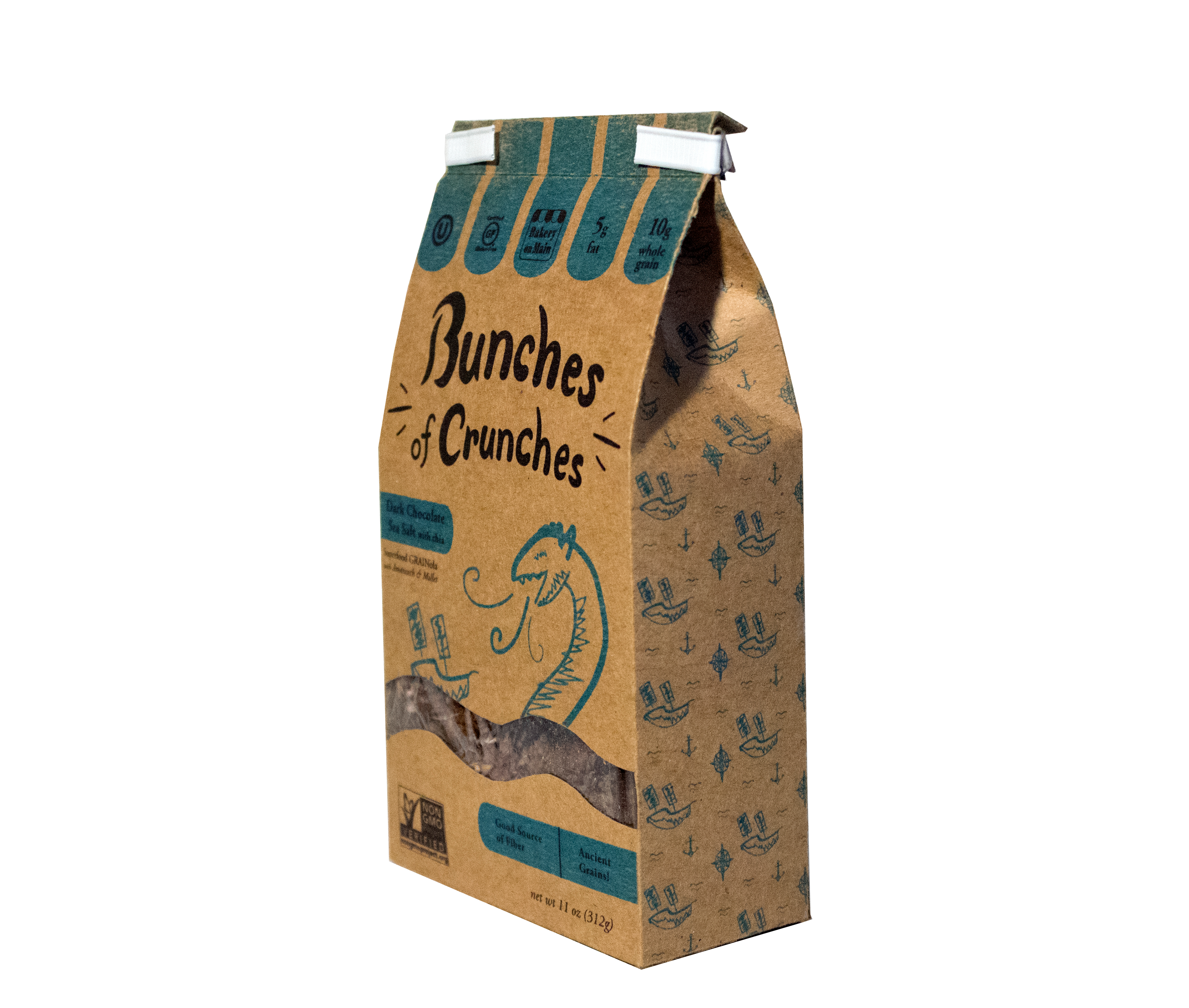
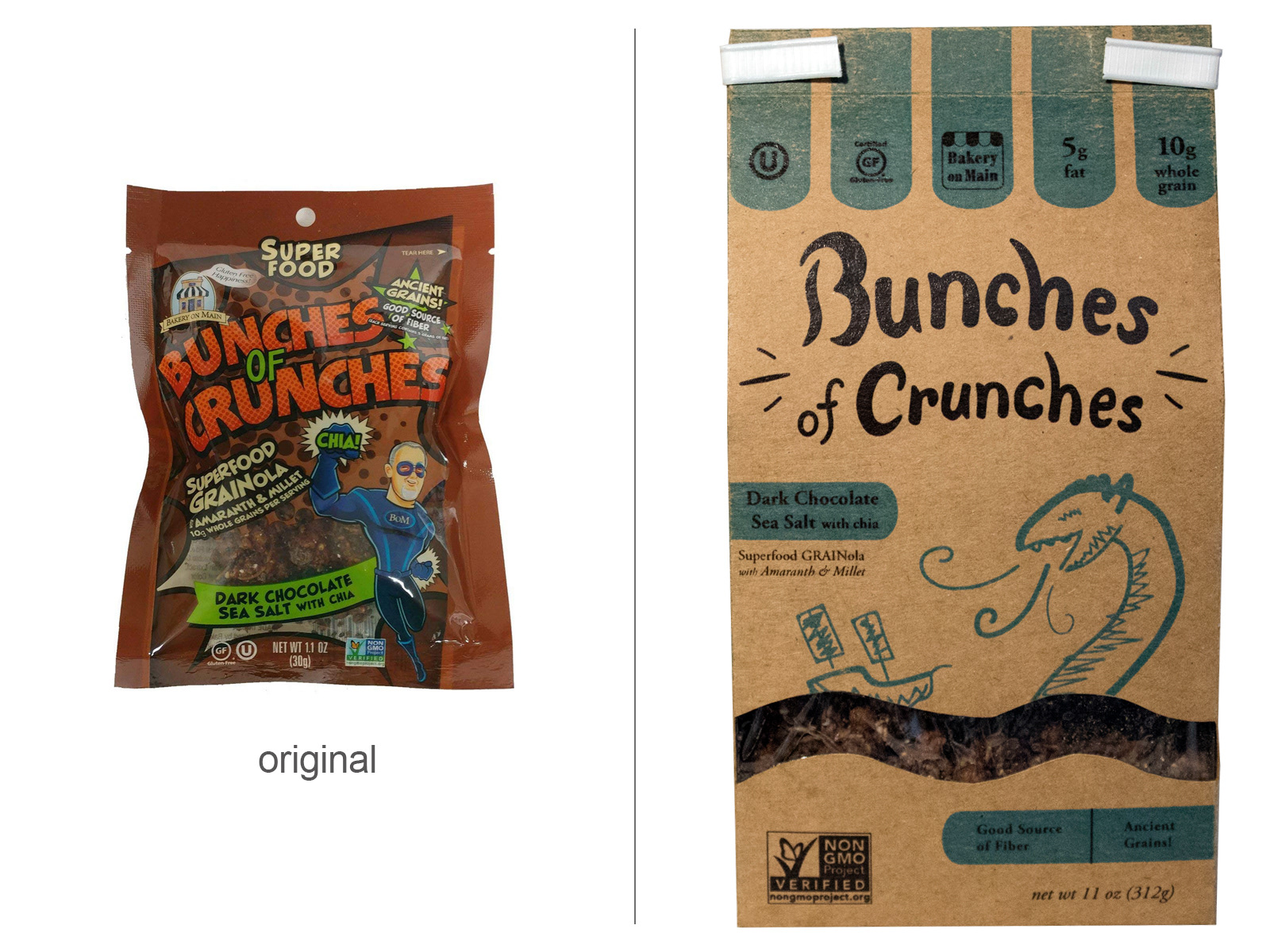
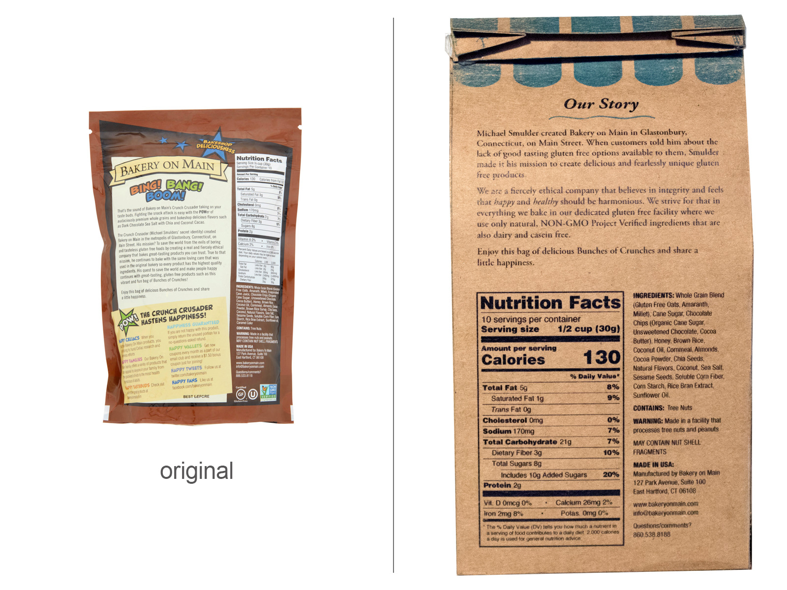
This was a packaging redesign project completed in my junior year. The original packaging for Bunches of Crunches failed to focus its marketing on any particular demographic. The redesign is geared towards a younger audience who would likely be interested in the fun flavors. The redesign achieves a healthier appearance by using natural brown paper and a two color print.